- Role / Services
Web redesign
- Credits
- Year
2021
Project objective
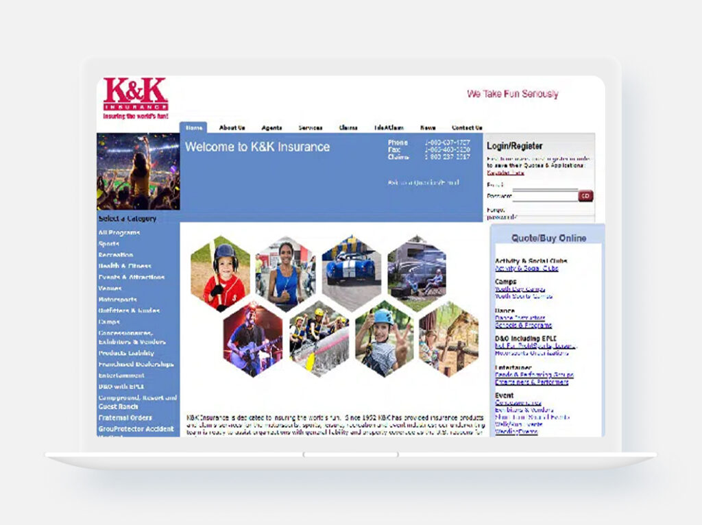
Since 1952, K&K has provided specialized insurance for leisure and sports entertainment. The company pays commissions to agents and offers over 70 special risk programs.
The main goal of this project was to enhance the user experience by optimizing the information architecture, highlighting the company’s key services, and reducing the time users spent searching for key information.
My rol
Issues
Design Process
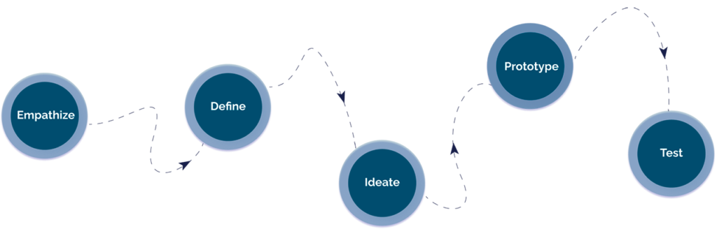
User Research
Below I detail the most relevant points of the research that led me to make the most important decisions for the web redesign.
First, the most important thing was to understand the audience I was going to communicate to, answering some questions such as:
- Who is interested in sports, leisure, and entertainment insurance?What does insurance include?
- Why do people get insurance?
- What should be taken into account when purchasing insurance?
Pain points
Goals
- The site is built with outdated technology and lacks responsive design, making it difficult to use across various devices and screen sizes.
- Communication feels cold and lacks empathy, weakening the emotional connection with users.
- It does not follow the company’s brand guidelines, resulting in a lack of visual consistency.
- The site fails to build trust, especially with potential clients experiencing their first contact through this platform.
- Information is not organized or filtered properly, creating cognitive overload and making navigation confusing.
The company has over 65 years of experience, which builds strong trust and credibility in its field.
Enhancing its communication strategy will improve relationships with current clients and attract new potential customers.
It has strong organic search visibility compared to competitors, giving it a clear advantage in digital presence.
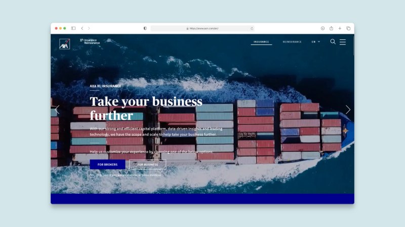
Benchmark
To get a real picture of K&K Insurance compared to its competitors, I followed two paths:
First results in the search for insurance for leisure and sports entertainment
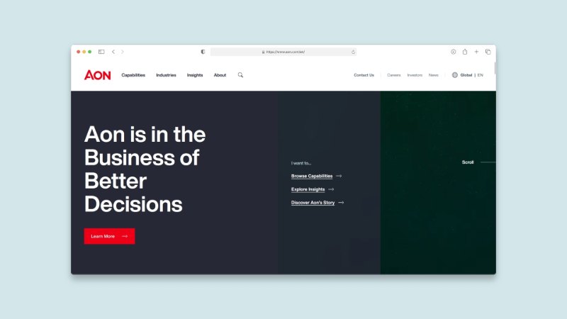
www.aon.com
(K&K was sold to Aon plc in 1993 but continues under the K&K name)
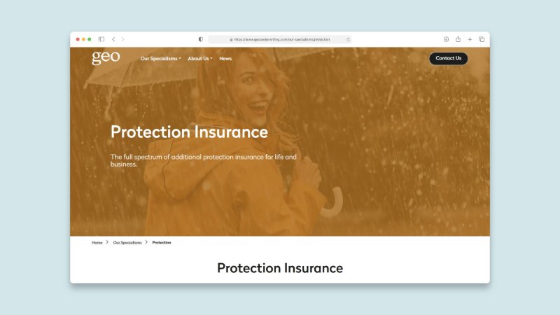
www.geounderwriting.com/our-specialisms/protection
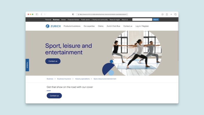
www.zurich.co.uk/business/business-insurance/industry-specialisms/sport-leisure-and-entertainment
This platform shows that beyond the lack of functionality presented by the website organic traffic compared to payment traffic is higher than that of its competitors

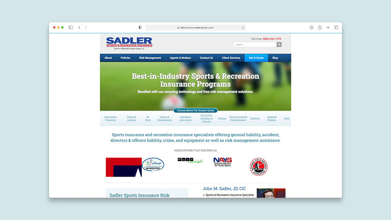
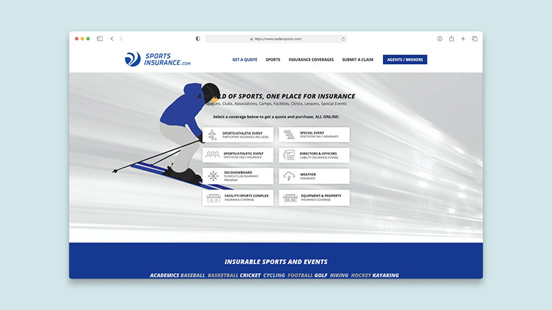
wwww.sadlersports.com
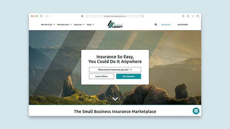
www.insurancecanopy.com
Define
After collecting the necessary information and studying the competition, I was able to define the problem. Based on real data, with the user's perceptions, frustrations, wishes, goals and expectations.
Ideate
Designs
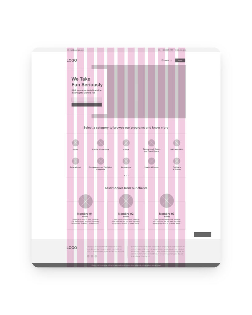
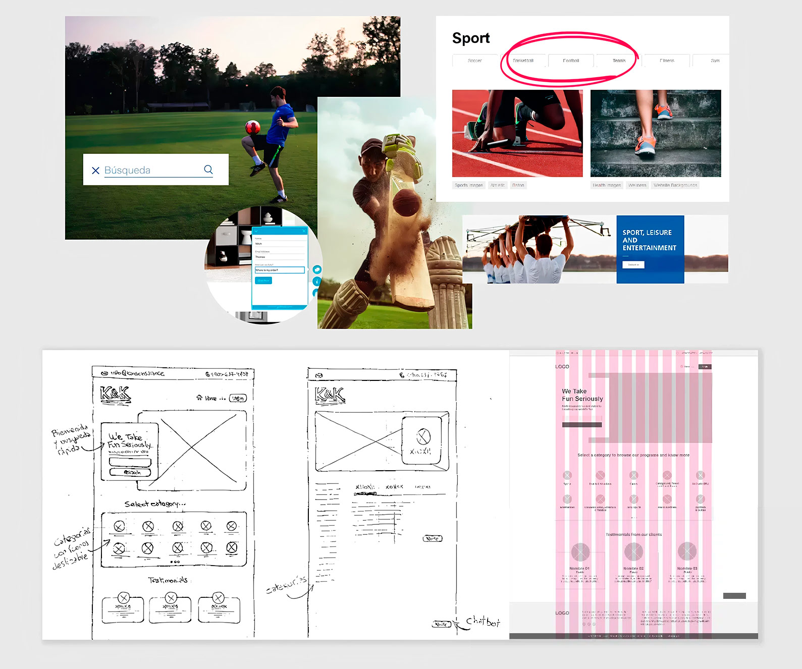
Wireframe
This wireframe is built on a 12-column grid, ensuring a balanced and flexible layout. Visual hierarchy is clearly defined, guiding users from the main message to key service categories. The modular structure supports quick scanning and improves navigation flow. Its user-centered design enables efficient access to essential content.
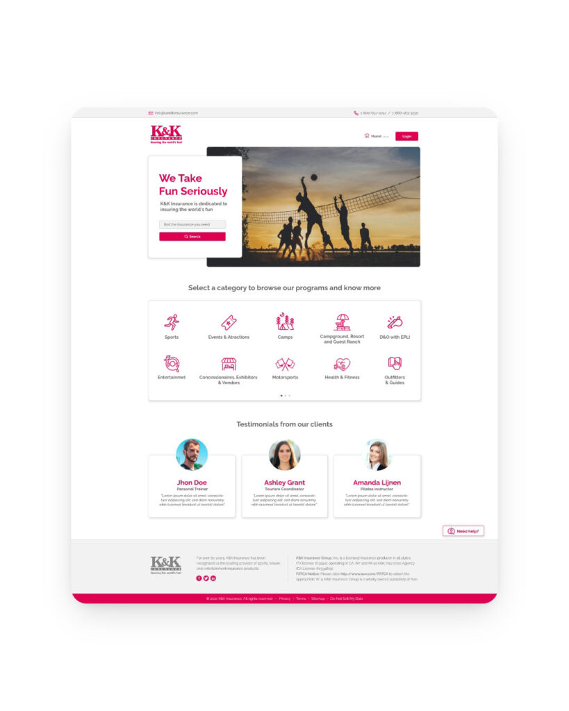
Home
This design delivers a clear, user-friendly, and visually engaging experience aligned with K&K’s brand identity. It highlights the company’s core message “We Take Fun Seriously” with a prominent search bar to quickly guide users to the insurance they need. Category-based navigation improves content accessibility, while client testimonials build trust. The overall structure emphasizes clarity, visual hierarchy, and ease of navigation to reduce friction and improve engagement.
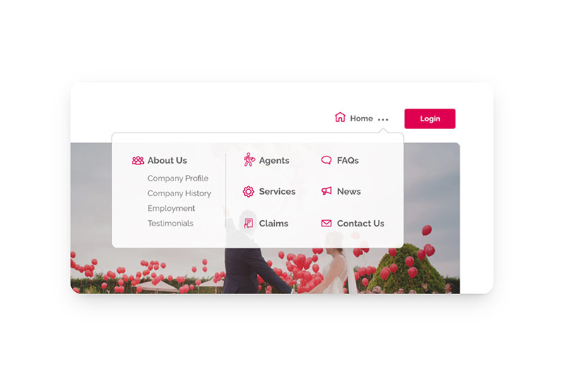
Main menu
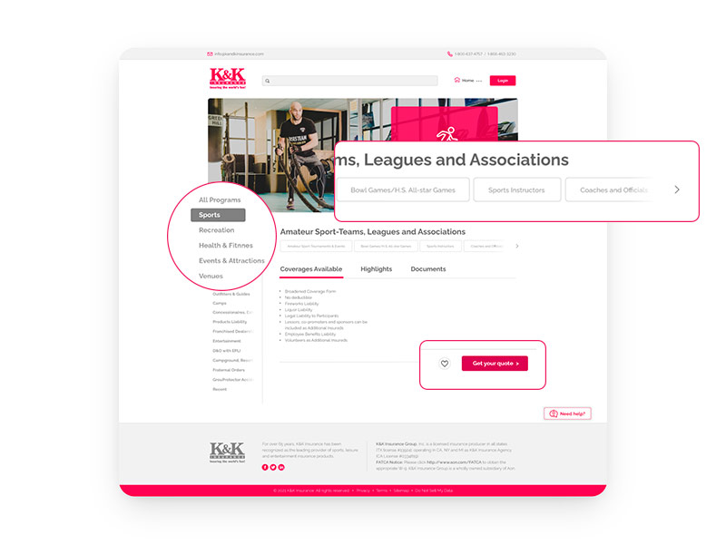
Internal Sections
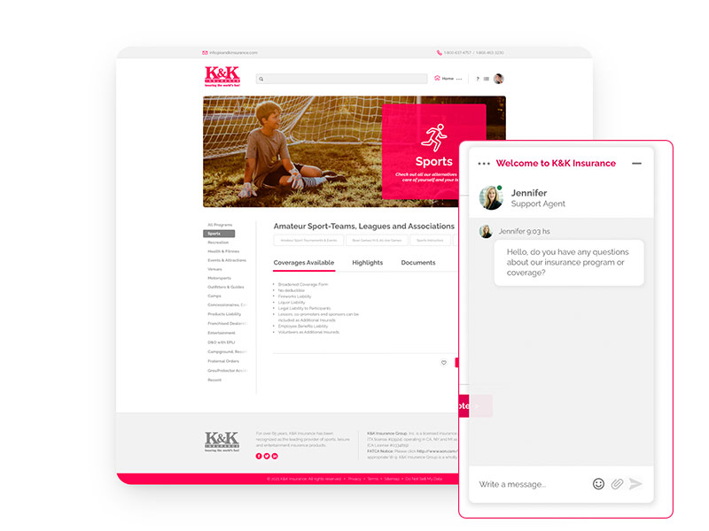
Chat support
Typography
Raleway
- Bold
- Medium
- Regular
Color
#FFFFFF
#666666
#444444
#F2F2F2
#FFFFFF
#666666
#444444
#F2F2F2