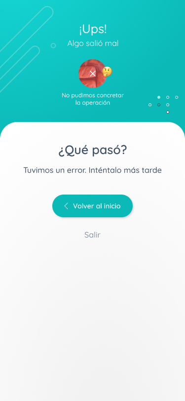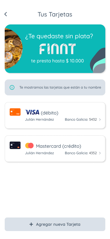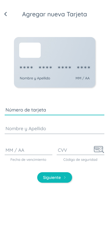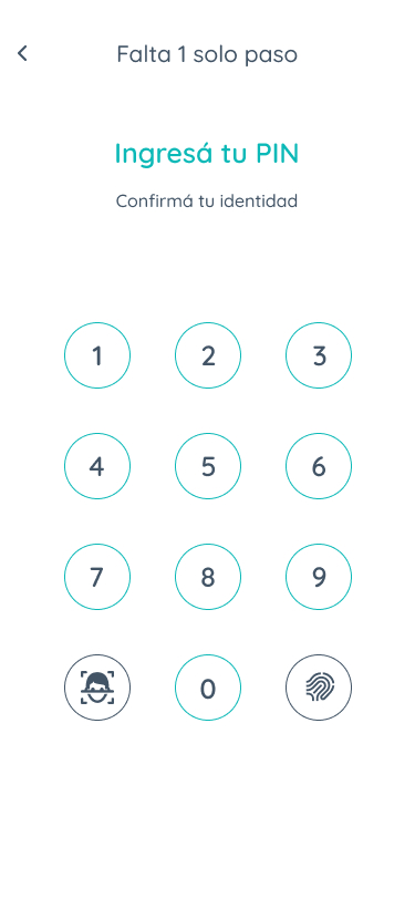
FINNT – Wallet Experience

Product Designer (UX/UI)

Contact / Foreign client

Perú / 2022

Project objective

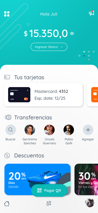
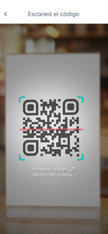
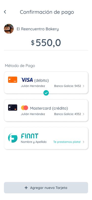
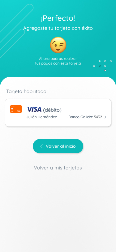
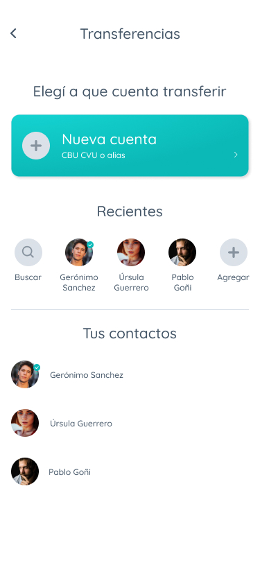
Finnt was designed to solve a specific pain point: the ‘wallet-less’ professional. Our target user, Charly, is a 29-year-old Marketing Analyst who lives in an urban environment. He constantly relies on his smartphone for everything—work, communication, and payments—but often forgets his physical wallet at home. The goal of the project was to create a mobile experience that allows users to send money and pay via QR codes in a secure, intuitive, and extremely fast environment.

My rol

Led the end-to-end product design process: I took full ownership of the project, from initial user research and persona conceptualization to high-fidelity UI execution, ensuring a cohesive vision throughout.

Applied Design Thinking methodology: I utilized a human-centered approach to translate complex fintech requirements into a simplified, scalable mobile architecture, prioritizing functionality and user impact.

Mobile-First Strategy: Focused on the “wallet-less” user journey, I bridged the gap between complex banking operations and intuitive interaction design, ensuring accessibility and ergonomics were central to the product strategy.

User research

The research phase was critical to define the project’s direction. By synthesizing user behavior, I identified that the primary friction point for our target audience wasn’t the transaction itself, but the cognitive load caused by cluttered banking interfaces. I transitioned from a traditional banking perspective to an ‘on-the-go’ digital experience, focusing on high-frequency, low-friction interactions. This shift in empathy allowed me to prioritize features that solve real-world problems, such as rapid QR scanning and instant fund verification, creating a solution that feels essential rather than just functional.

Define

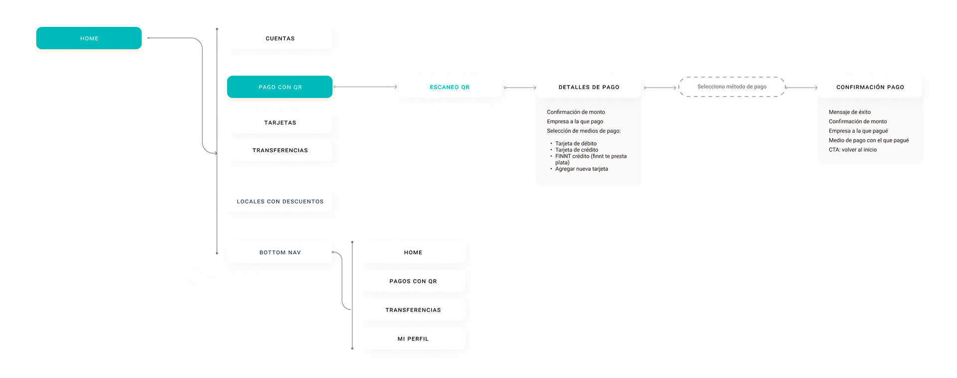
Using Design Thinking as my core methodology, I transitioned from raw insights to a clearly defined problem statement. I mapped out the 'Jobs-to-be-Done' for our persona, transforming business constraints into clear design opportunities. By structuring the information architecture (IA) early in this phase, I ensured that every design decision supported the ultimate project goal: reducing user effort and maximizing transaction speed. This structured definition allowed me to validate the navigation paths before committing to high-fidelity visuals, ensuring the solution was both viable and user-centric.

User person

Insight

Carlos needs a way to make payments effortlessly. He doesn’t want to deal with cluttered interfaces or complex banking jargon; he values efficiency, security, and a 'one-tap' experience for his daily transactions.

“Charly” – Carlos Alvarez
  • Age: 29 years
  • Profession: Analista Sr. De Marketing
  • Location: Lima
The Persona: Carlos is a heavy mobile user who thrives in a fast-paced environment. He prefers digital-first solutions and avoids physical banking whenever possible. He relies on his smartphone for every aspect of his daily life, from food delivery to professional work.

Information architecture

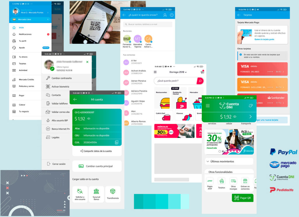
Moodboard

Sketches

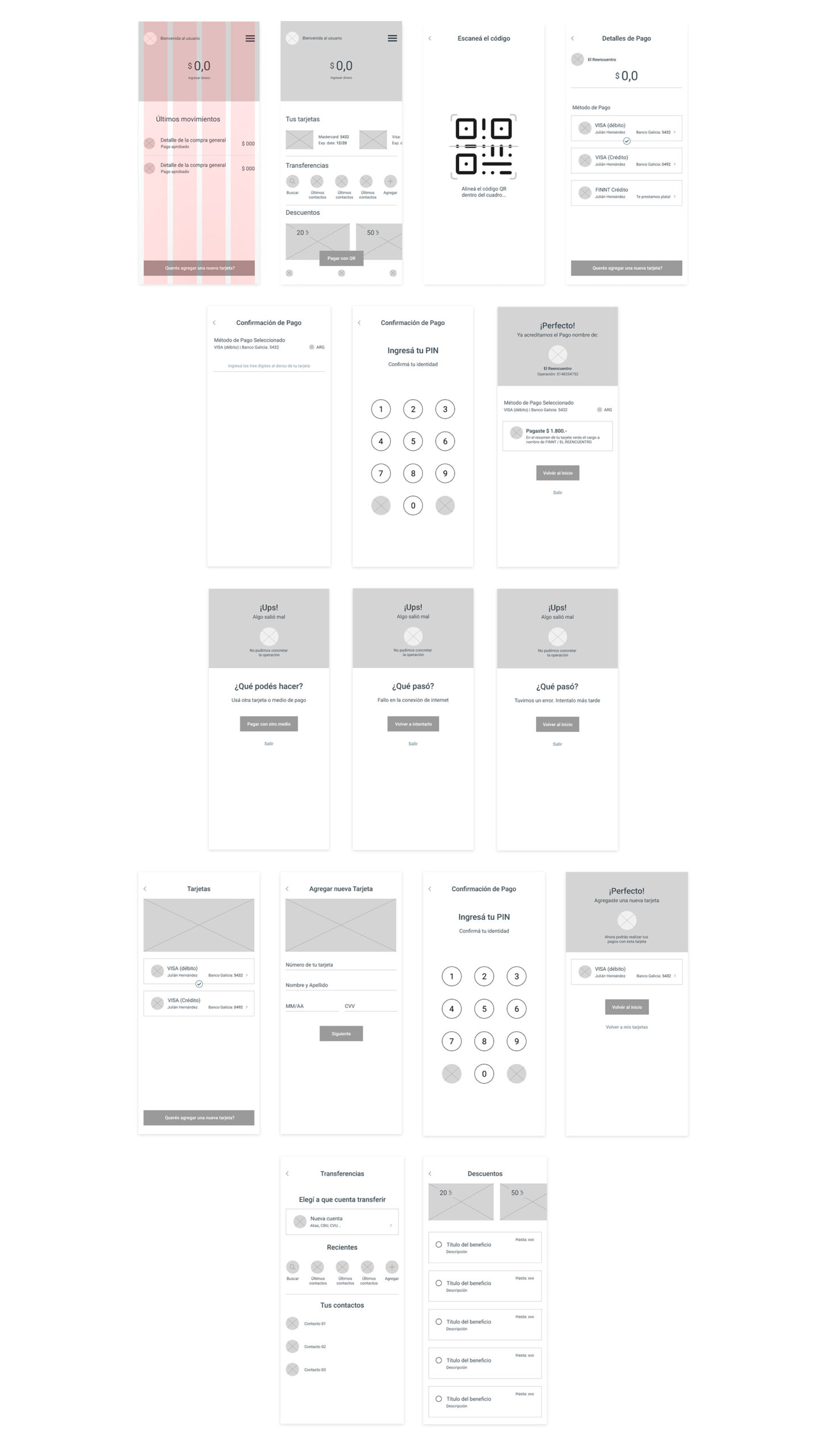
Wireframes LO-FI

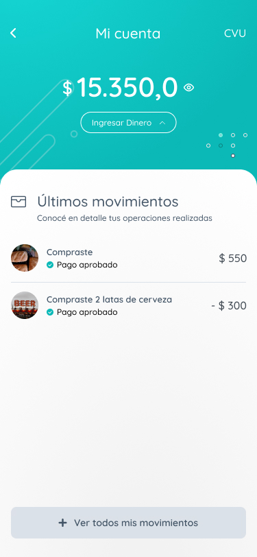
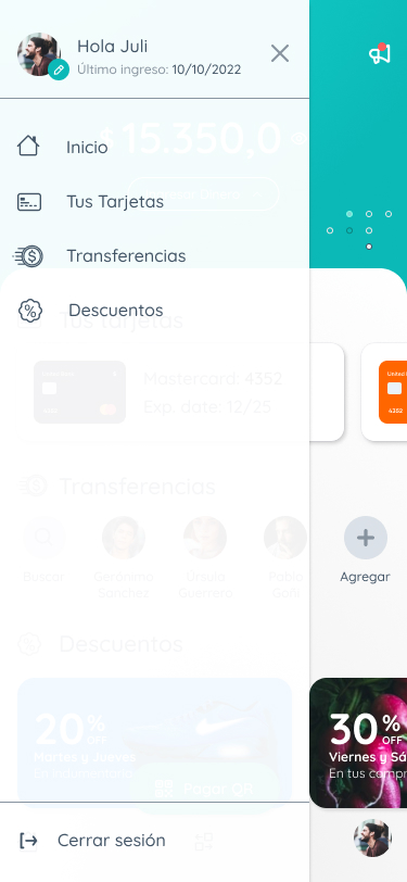
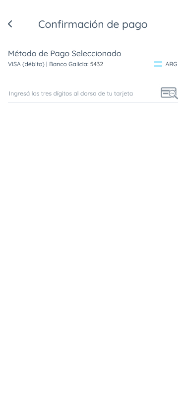
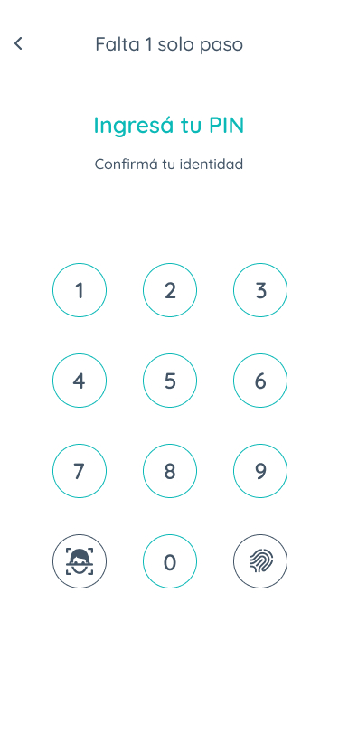
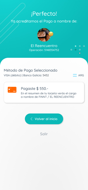
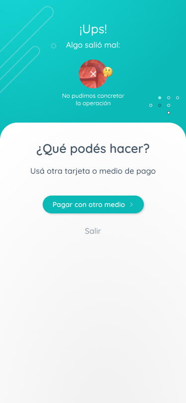
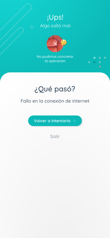
Wireframes HI-FI

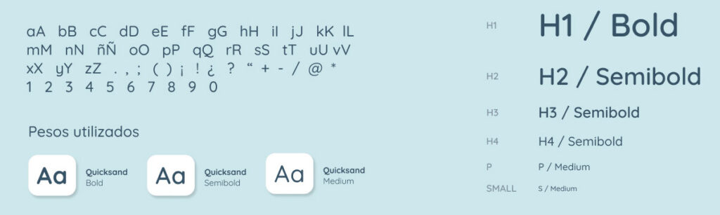
Typography
Quicksand
Colors

#0BB9B7

#424B54

#0CC1D3

#425466

#87939F

#0BB9B7

#7CF8E1

#424B54

#425466

#87939F

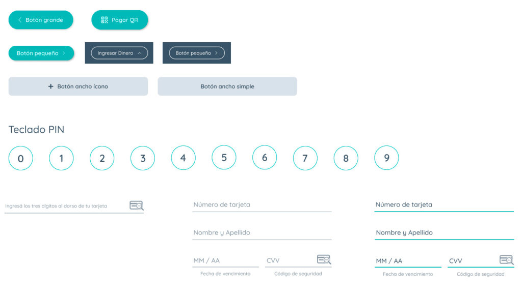
Buttons and fields
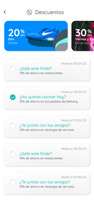
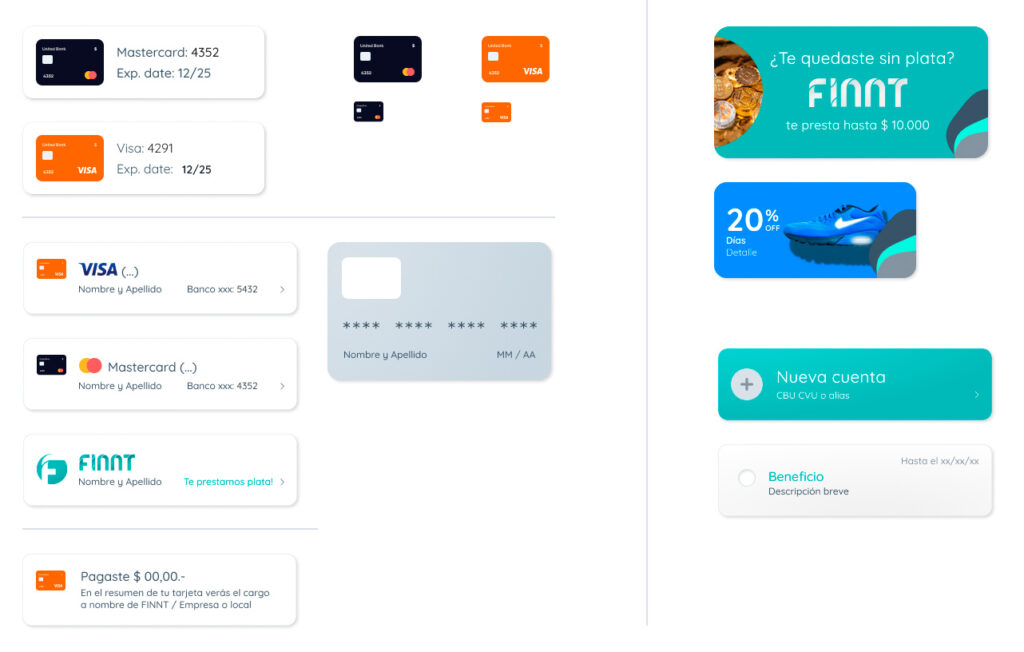
Cards and Promotions
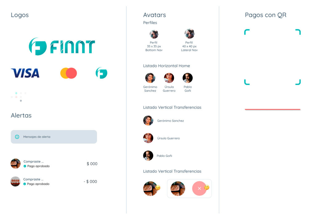
More componets
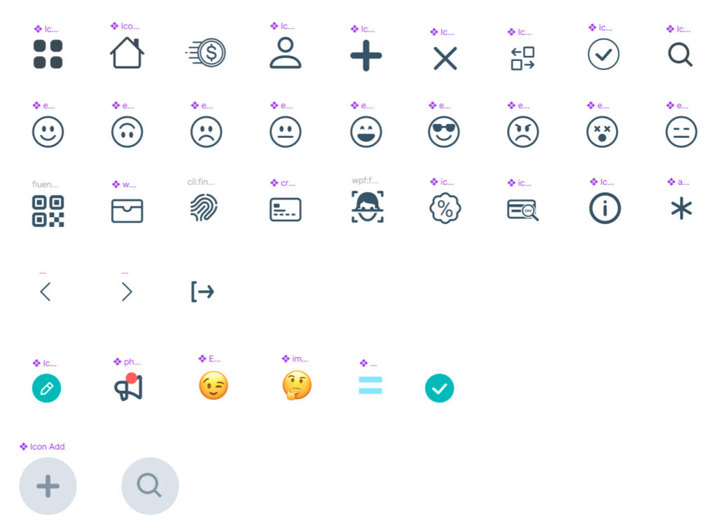
Icons