- Role / Services
Redesign & Develop
- Credits
Contact / Todo para SUP
- Location & Year
Project objective
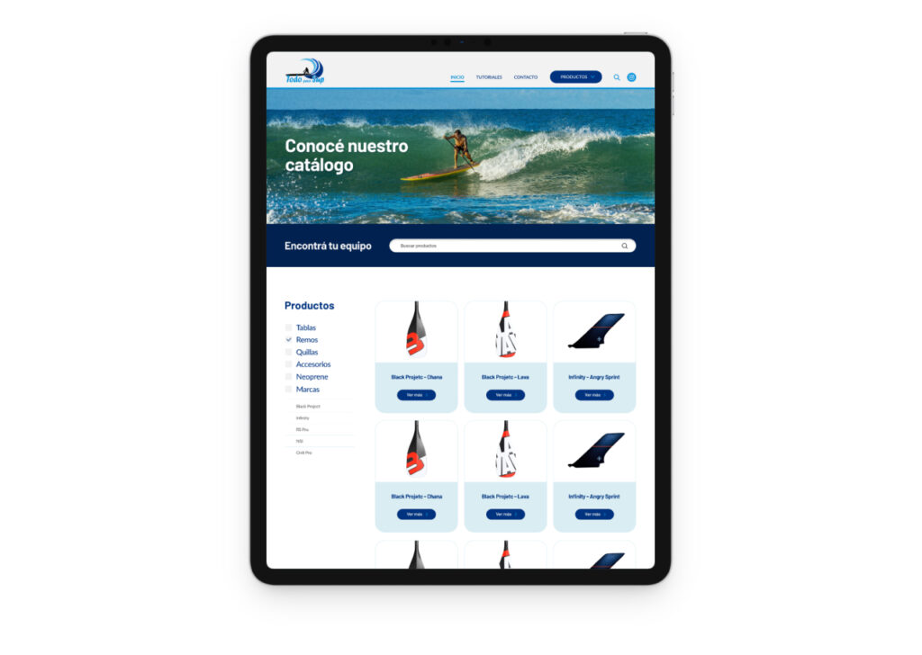
The main goal was to showcase the brand’s philosophy and product catalog through a renewed platform and improved user experience. The redesign aimed to modernize the interface, highlight the company’s values, and create a more intuitive browsing journey for customers.
My rol
As a UX/UI Designer, I was responsible for:
- Conducting user research and analyzing customer feedback.
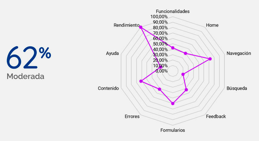
- Identifying usability issues in the current website.
- Designing wireframes, prototypes, and the final user interface.
- Defining the design system (colors, typography, icons, and components).
- Ensuring a cohesive brand identity across the platform.
Issues
The existing platform presented several problems:
- Outdated visual design that did not reflect the brand’s philosophy.
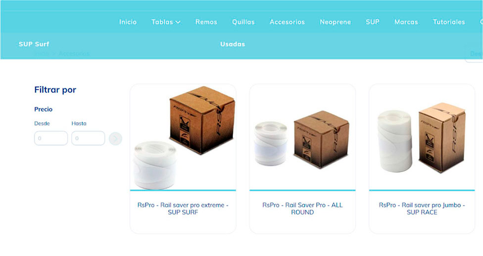
- Limited product presentation, making it difficult for users to explore the catalog.
- Poor user flow with friction in navigation.
- Lack of engagement opportunities between the brand and customers.
Before Redesign
Heuristic evaluation
Design Process

User Research
Through surveys and user behavior analysis, the following pain points and goals were identified:
Pain points
Goals
- 62% of users abandoned the platform due to poor navigation.
- Users struggled to find relevant product information quickly.
- The lack of a clear brand message reduced trust and engagement.
- Navigate the catalog easily with a clear and consistent structure.
- Access detailed product information without unnecessary steps.
- Connect with the brand’s values and philosophy.
- Receive quick responses to inquiries.
User person

Insight
Clau needs a way to buy a new board, but considers it a difficult product to purchase virtually, and needs to clear up all possible doubts before making a decision.

“Clau” – Claudio Sand
-
Age: 35 years
-
Profession: Senior Marketing Analyst
-
Location: Necochea
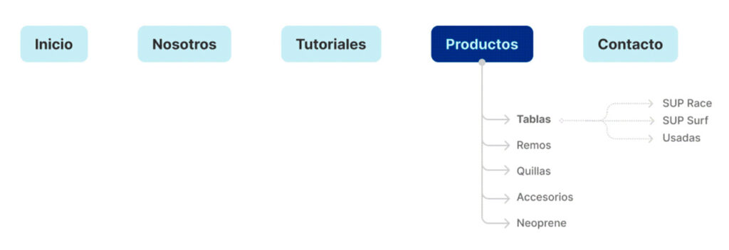
Information architecture
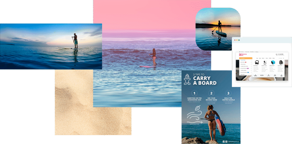
Moodboard
Wireframes LO-FI
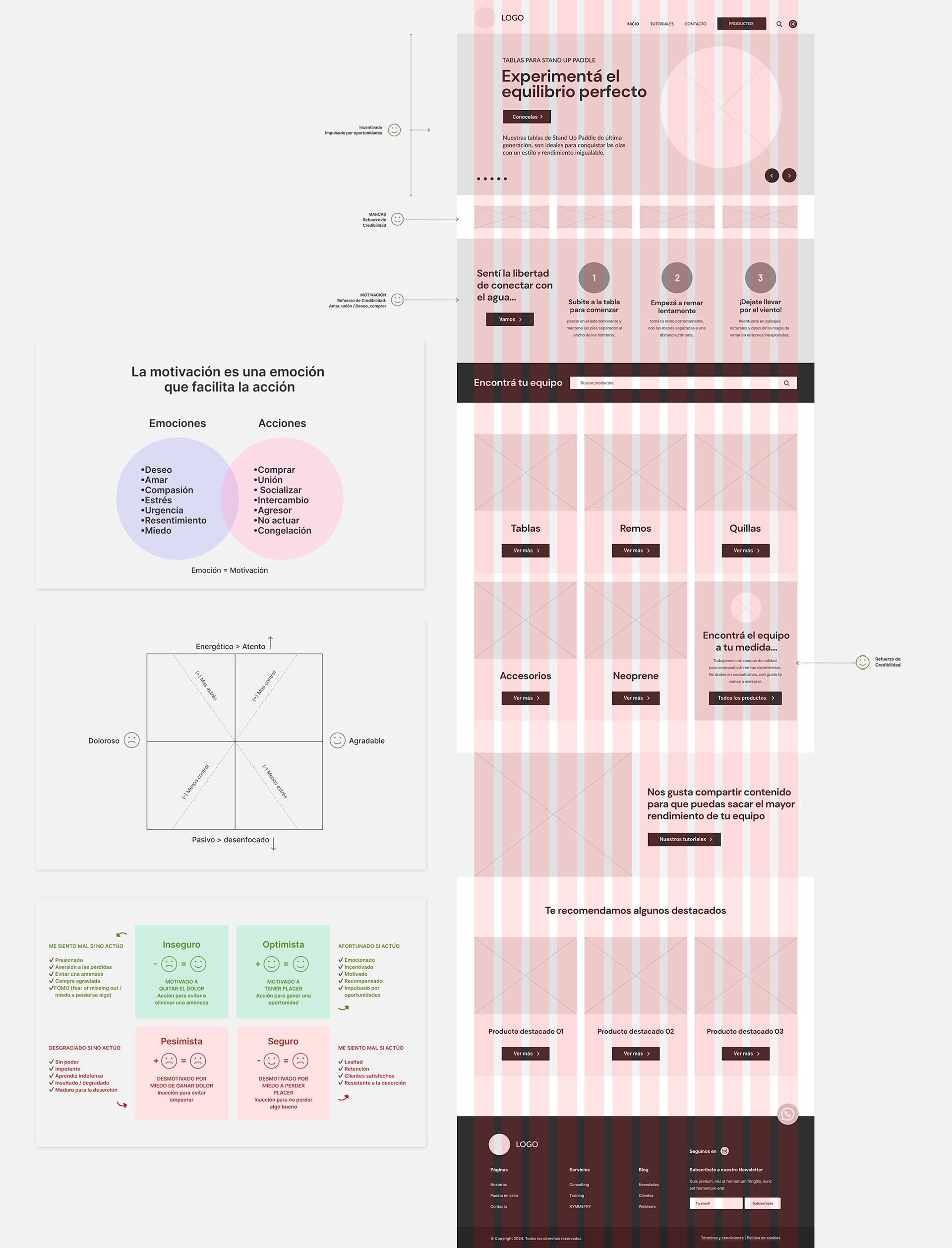
Wireframes HI-FI
Product Categorys
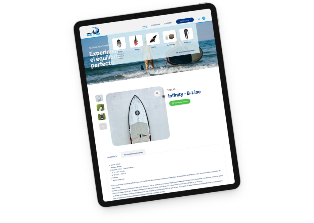
Product Detail Page
Typography
Barlow - Headings
- Bold
Lato - Text
- Bold
- Regular
Color
#00337F
#008ED8
#00ADC3
#666666
#F2F2F2
#00337F
#008ED8
#00ADC3
#666666
#F2F2F2
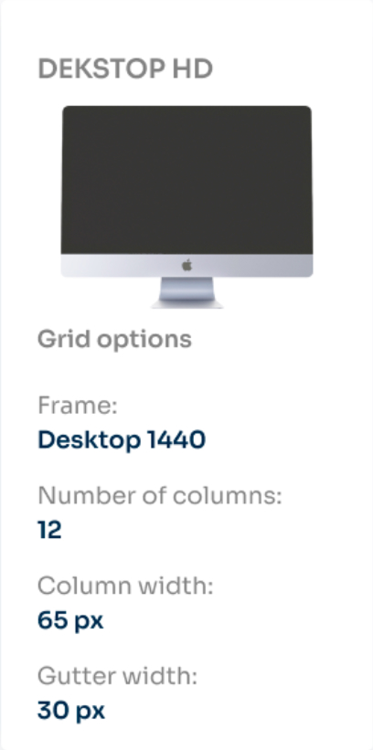
Grids
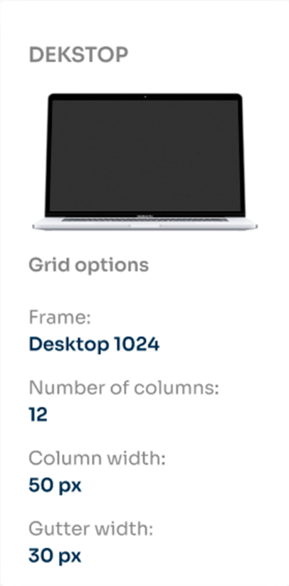
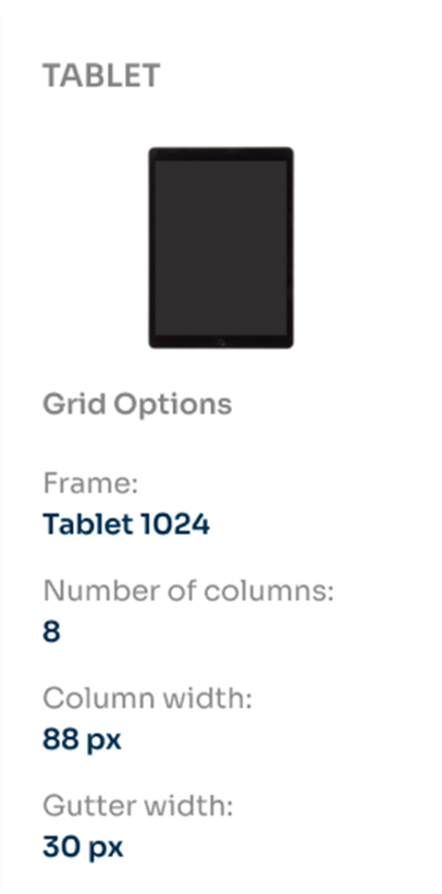
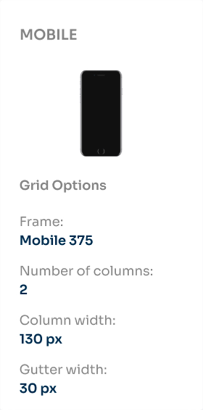
Final Design & Impact
The final design delivered a modern and intuitive platform that successfully reflected the brand’s philosophy while improving usability.
Key Outcomes:
- Improved navigation: Users could now explore the product catalog in a clear and structured way, reducing friction in the browsing experience.
- Stronger brand identity: The renewed interface and consistent design system reinforced trust and aligned with the brand’s values.
- Higher engagement: Clear calls-to-action and a dedicated contact section encouraged users to interact with the brand and submit inquiries.
- Responsive experience: The platform was optimized for desktop, tablet, and mobile, ensuring accessibility across devices.
This redesign not only enhanced the user experience but also provided the brand with a digital platform capable of generating stronger engagement and showcasing its product catalog more effectively.

