Redesign the digital presence of a creative agency to better reflect its values, portfolio, and strategic capabilities. The new website needed to improve usability, visual appeal, and content structure—transforming the outdated interface into a modern, functional, and mobile-first experience aligned with user expectations and business goals.
My rol
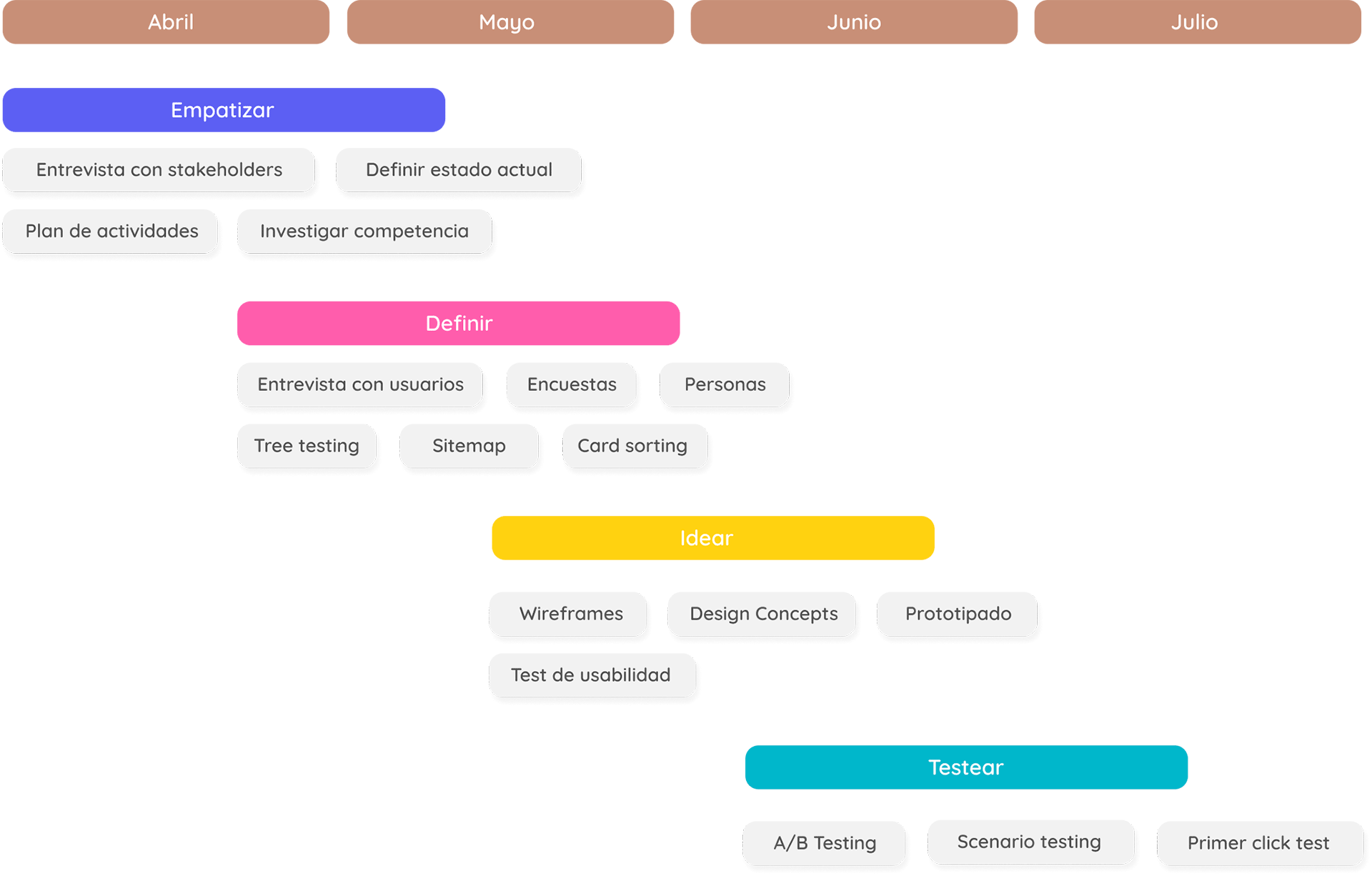
I led the UX/UI redesign process from end to end. This included stakeholder interviews, UX research, competitive analysis, and visual concept development. I structured the information architecture, created wireframes and high-fidelity prototypes, and defined a scalable design system. I also collaborated with developers to ensure a smooth handoff and proper implementation.
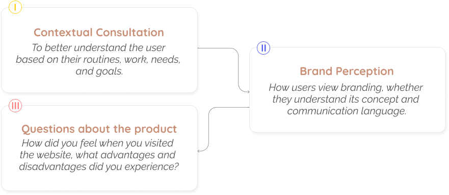
User research
To understand user needs and frustrations, I conducted interviews and user testing sessions with both clients and agency staff. Insights revealed key pain points:
Users struggled to find relevant case studies.
The previous design lacked emotional connection and brand coherence.
Mobile users abandoned the site due to slow performance and poor layout.
I also benchmarked competitor sites and analyzed behavioral patterns via heatmaps and analytics.
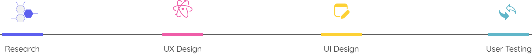
Empathize
"We need a new, more agile and minimalist website where users can understand how we work and feel about us, with the trust and warmth of the people's spirit to convey their needs."
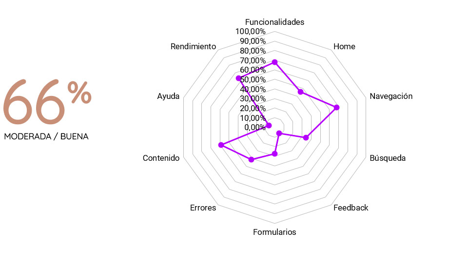
Usability percentage of the previous website
Heuristic evaluation
Good: In the range of 69 to 89. Users should be able to use this digital product with relative ease and should be able to complete the vast majority of important tasks.
Previous
I recruited around 20 people, from clients to users of different social networks.
Define
From research findings, I identified two core problems:
Lack of clarity in service offerings and navigation.
Poor storytelling of agency projects, weakening user engagement.
We defined two personas:
Client Persona: A marketing manager looking to quickly validate agency expertise.
Talent Persona: Designers and creatives exploring work culture and team vibe.
These insights shaped the foundation of the new structure and content priorities.
Ideate
I explored layout concepts, information hierarchy, and interaction patterns that would best serve the agency’s personality: bold, creative, but professional. Wireframes and UI concepts focused on:
Clear service navigation and call-to-actions.
Highlighting success stories with visual storytelling.
Responsive, modular components for future scalability.
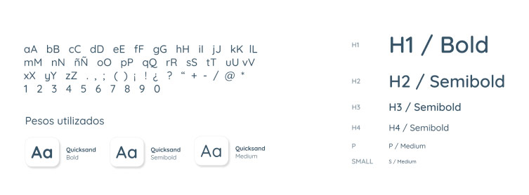
A revamped color palette and typography to express brand energy and trust.
The final design delivered a polished digital experience that communicates credibility and creativity while solving real user pain points.
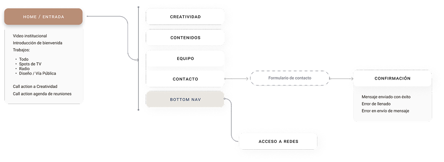
Information architecture
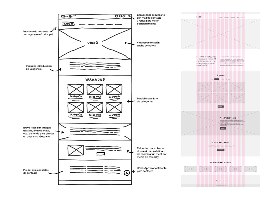
Sketches & First Wireframe
Wireframes HiFi
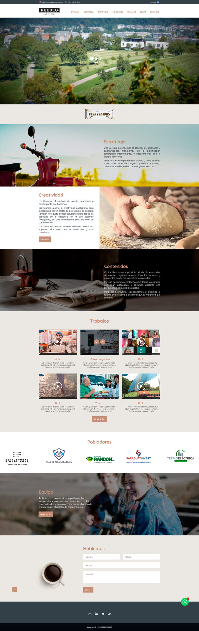
Home
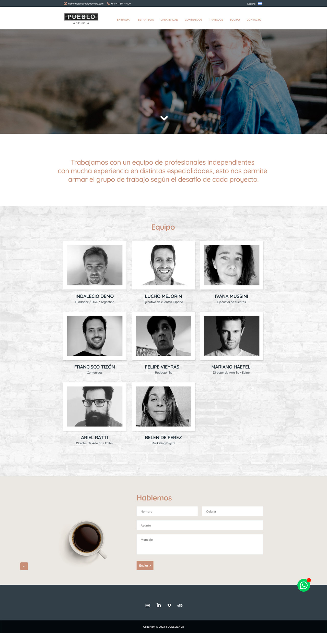
This design delivers a clear, user-friendly, and visually engaging experience aligned with K&K’s brand identity. It highlights the company’s core message “We Take Fun Seriously” with a prominent search bar to quickly guide users to the insurance they need. Category-based navigation improves content accessibility, while client testimonials build trust. The overall structure emphasizes clarity, visual hierarchy, and ease of navigation to reduce friction and improve engagement.
Team
This design delivers a clear, user-friendly, and visually engaging experience aligned with K&K’s brand identity. It highlights the company’s core message “We Take Fun Seriously” with a prominent search bar to quickly guide users to the insurance they need. Category-based navigation improves content accessibility, while client testimonials build trust. The overall structure emphasizes clarity, visual hierarchy, and ease of navigation to reduce friction and improve engagement.